Behind the Brand
Explore the story, process, inspiration, and meaning behind the Ten Ten Life logo and brand identity
“What is the story behind your Logo?”
We love getting the opportunity to share the story behind our logo and branding.
It is the result of intentional work, thought, and consideration, which we believe appropriately represents us as well as the communities we serve.
Goals
While developing the creative brief for the design process, Ten Ten Life defined goals and priorities for the logo to achieve and represent.
Needs to be iconic
Strong enough to stand alone
Immediately Recognizable
scalable—visible at both small and large sizes
Represent the values of the organization, not just the name
identify with and represent clients
cool and visually appealing—something people will want to wear
icon used as a subtle, unspoken marker of community and belonging
Logo Design Elements
The Ten Ten Life logo features distinct design elements that connect to the overall goals and intentions of the brand.
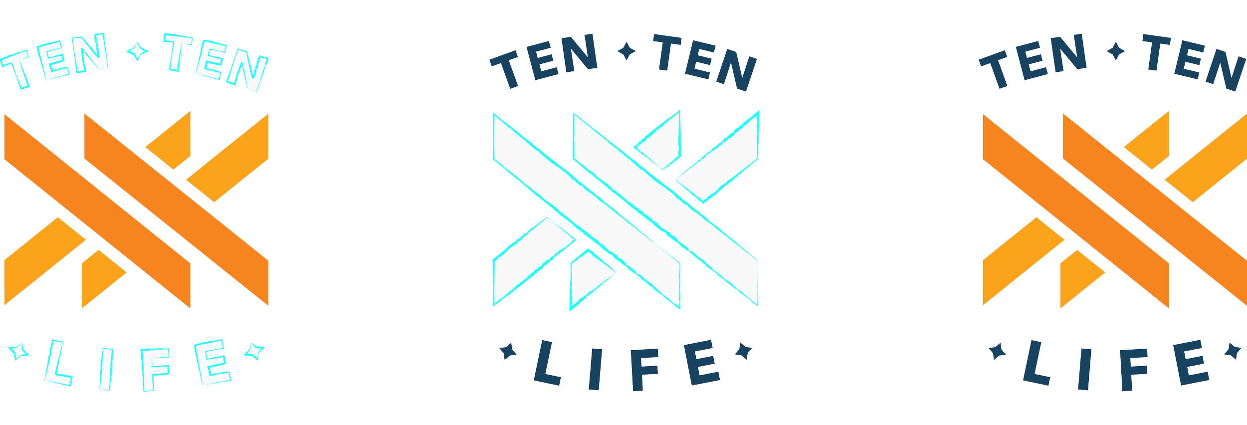
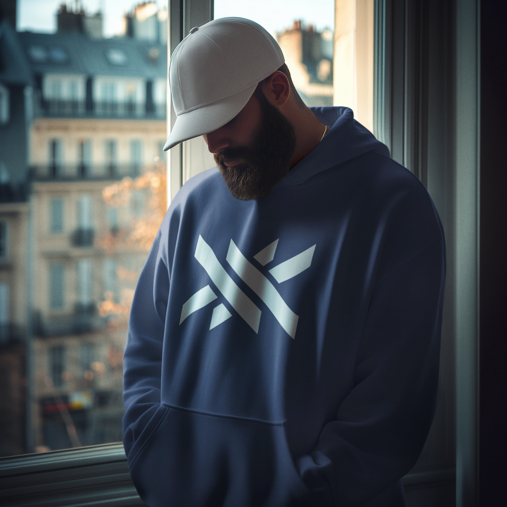
Two X’s
Forming the central structure of the logo icon, the prominently featured core design elements are two crossing “X” shapes—X being the Roman numeral for TEN (10)—which combine to quite literally spell out “TEN TEN.” After many attempts and iterations, this design most successfully incorporated the name into the logo in a direct manner, yet with some subtlety. TEN TEN is of course connected to the name “Ten Ten Life,” which is in turn inspired by the Bible verse John 10:10.
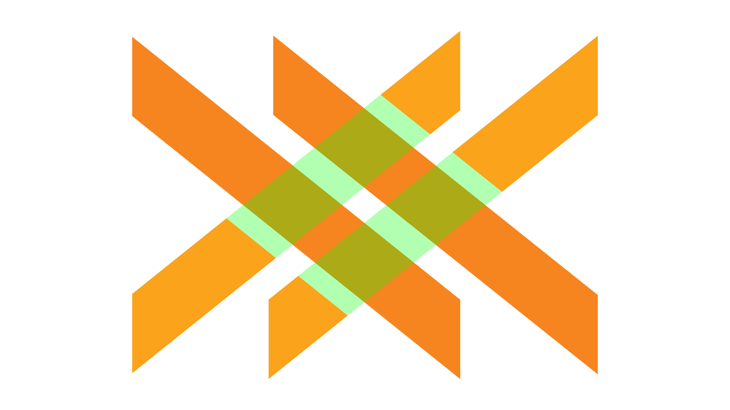
Intersections
At the center of the icon shape is a series of intersections between the criss-crossing “X” shapes. This represents the core value of Integration as well as the intersectionality of different areas of life and the overlapping connection of community
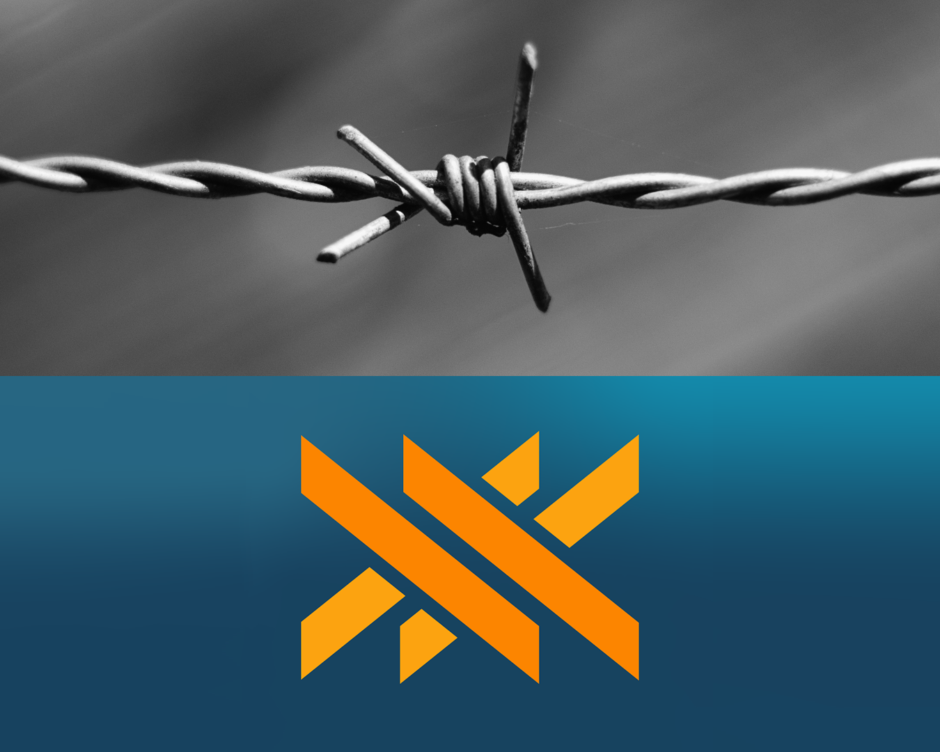
Barbed Wire
Taken as a whole, the icon shape bears a resemblance to the shape of an intertwined strand of barbed wire. Traditionally, barbed wire was used as a means of providing security and protection along fence lines. In our context, barbed wire also represents the sharp and painful moments of life, ones that leave a mark. We are committed to walking through that pain with our clients.
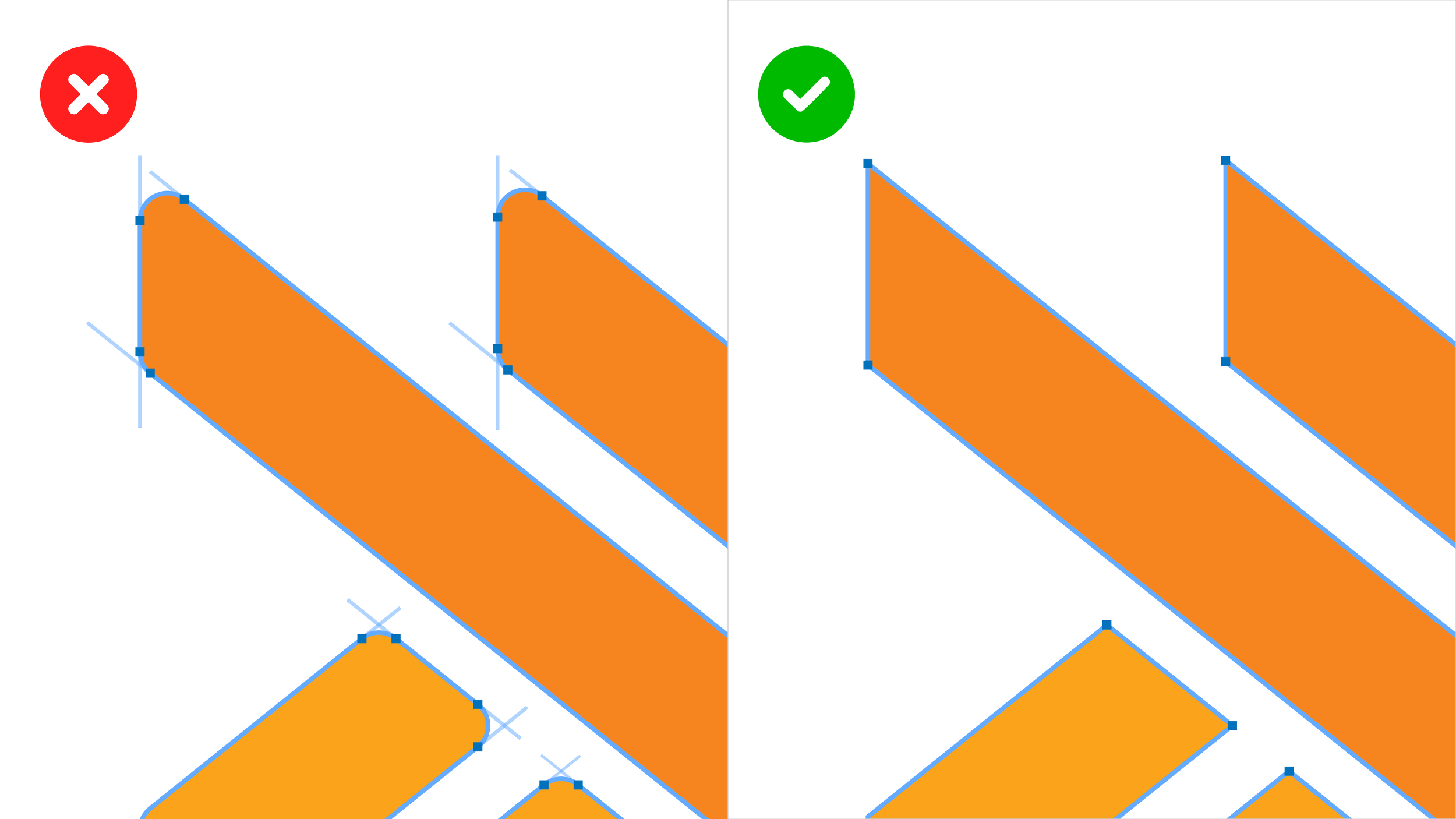
Sharp Edges
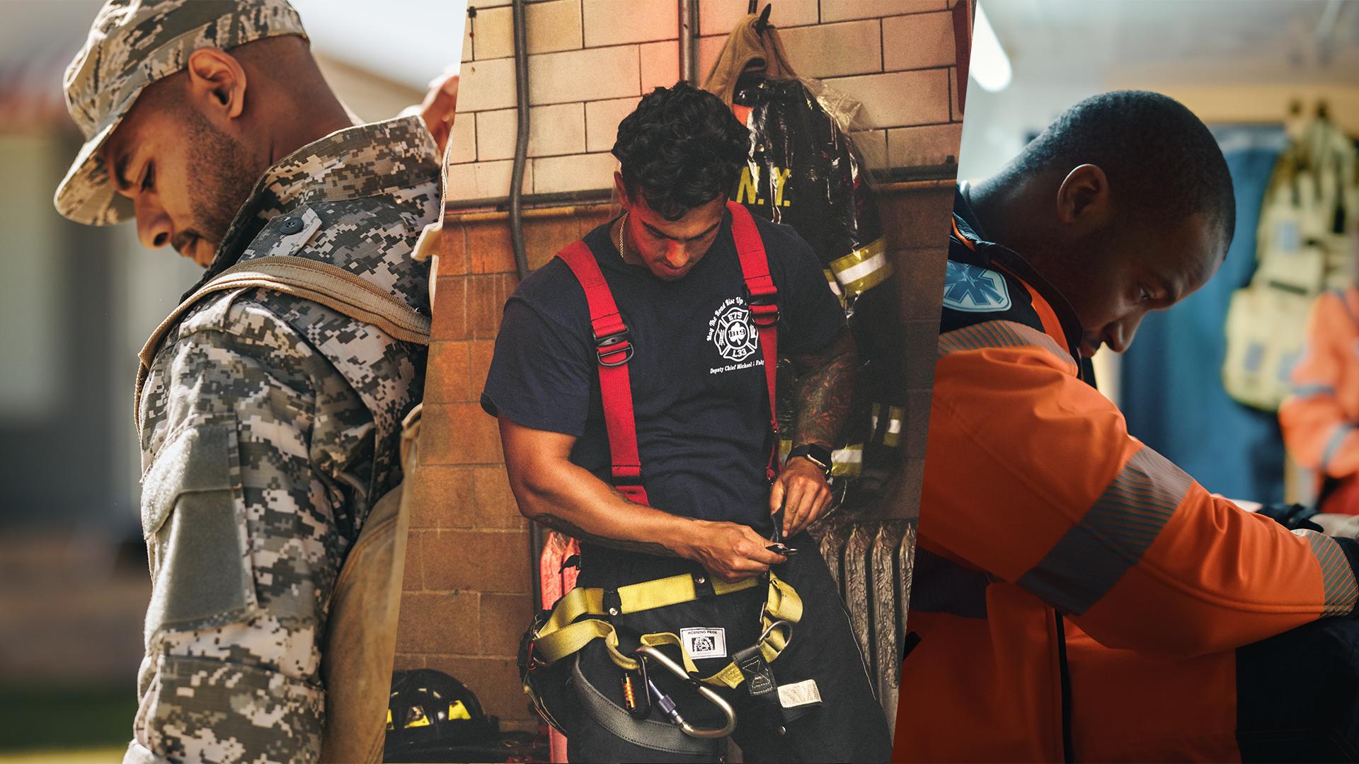
In designing the icon shape, the edges were intentionally left sharp and pointed, rather than soft and rounded. This is a way we reference and acknowledge the sharp biting and cutting reality of those who serve. Many military members, veterans, and first responders know all too well the searing, sharp pain of trauma experienced as a part of their daily duties.
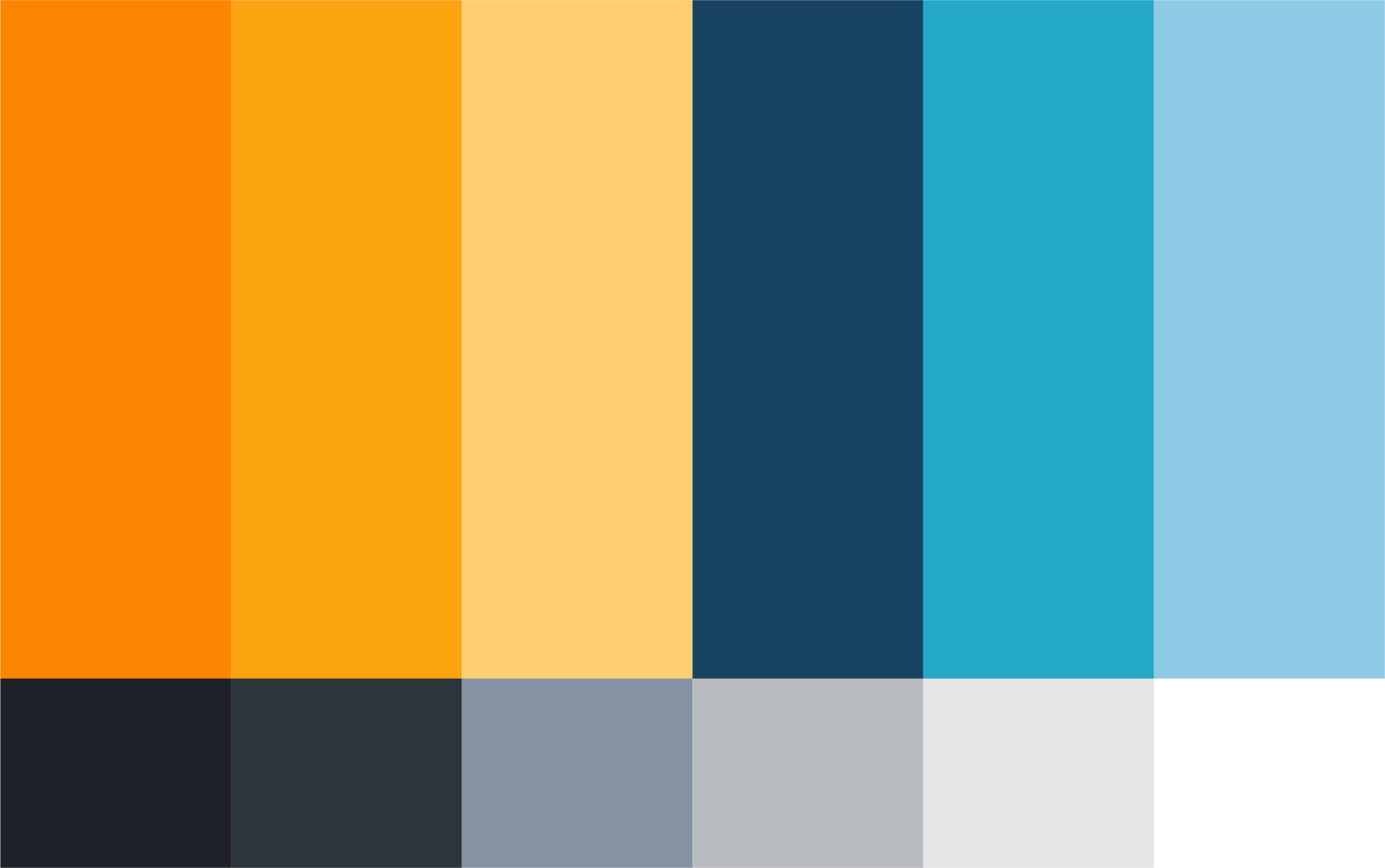
Color Palette
Orange was chosen as the primary color because it connotes action, movement, energy, and intensity. We believe our role as an organization is one of action and participation, walking alongside those who serve and helping them navigate the journey towards healing, growth, and thriving.
Navy blue was chosen as the secondary color because it works well with and complements orange as a color, but also is a non-specific nod to uniforms for military branches and law enforcement.
Iconic & Meaningful
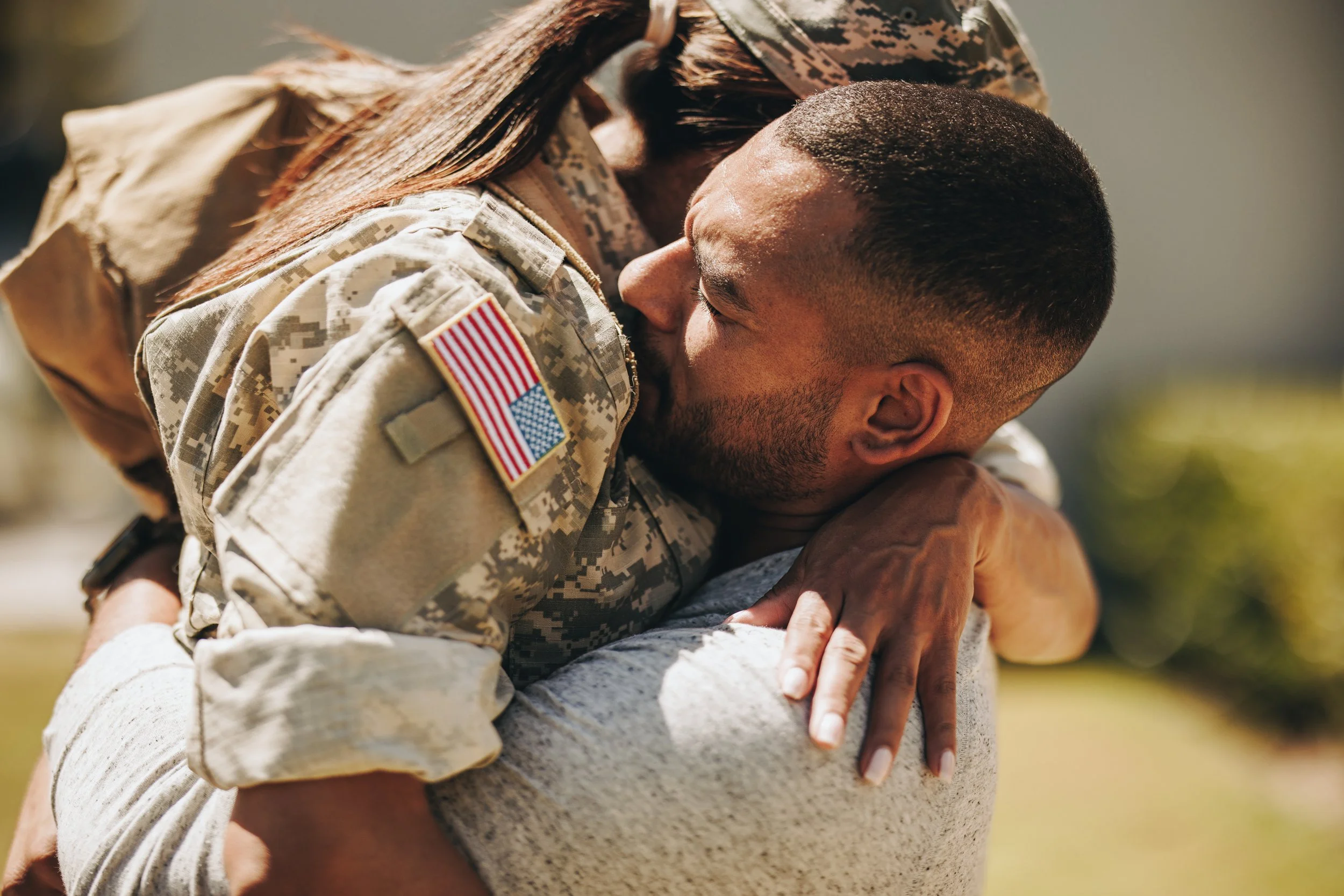
One hope and desire for the logo was that the design would be iconic and strong enough to stand on its own. The intention being that the icon—perhaps seen on a shirt or a window decal—could serve as an unspoken code of belonging and acknowledgement, a covert way to say you are part of this unique and supportive community. It’s more about belonging, less about broadcasting.
While we want the brand to be welcoming and accessible, we also want it to feel like a safe, protected, and inclusive brotherhood among our clients.
Versions & Iterations
Primary Logo
The primary logo is stacked with logo text above and below an orange icon. A reversed primary logo changes the text color to white, which provides greater contrast against dark and complex backgrounds.
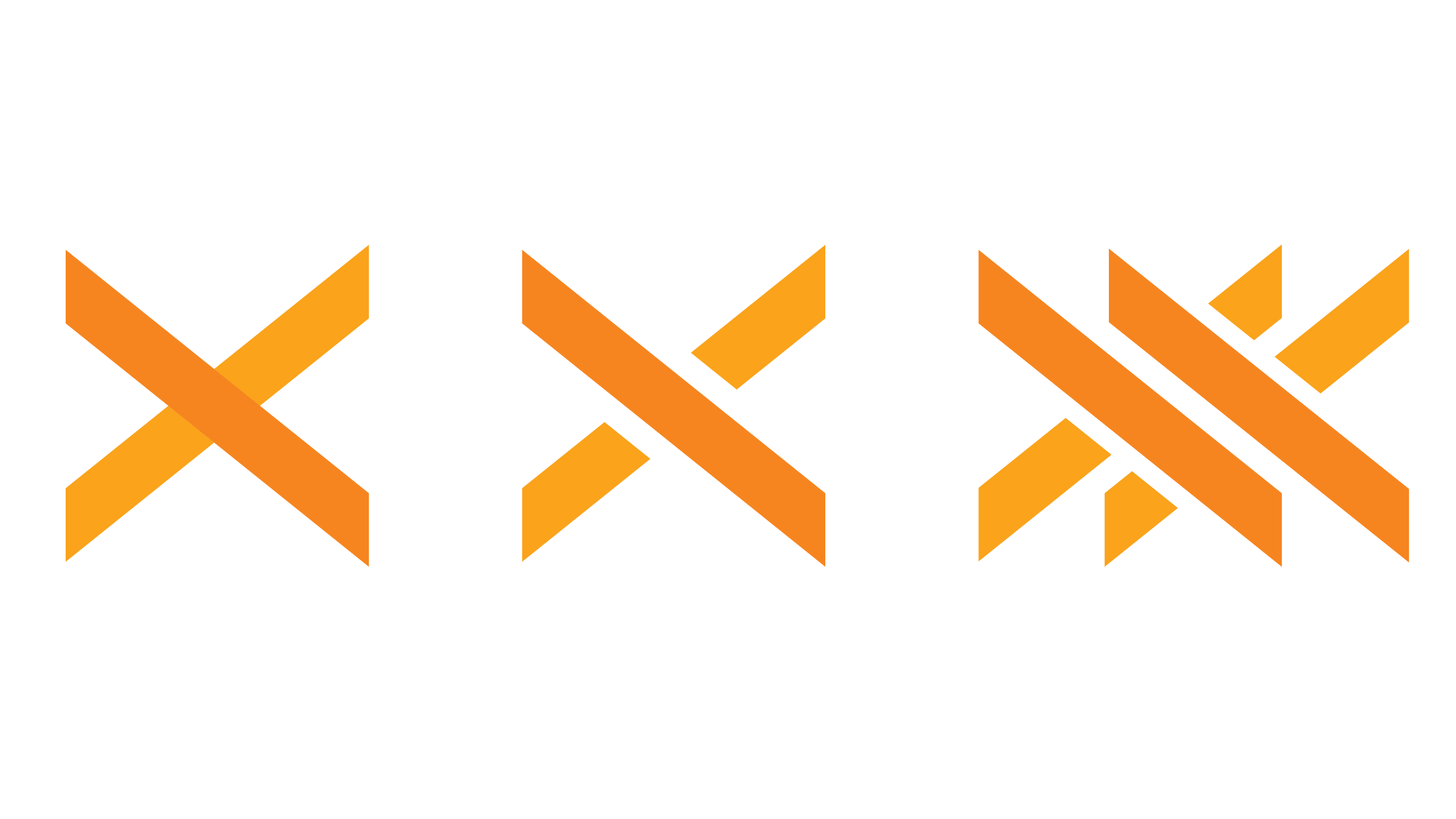
Secondary Logo
In certain instances, only the logo icon is used, without the logo text. This provides a clean and simple visual that can provide a visual reference to Ten Ten Life without detracting from other content and messaging.
Horizontal Logo
In limited circumstances, an alternate, horizontal version of the logo icon is used to fit better in the available space and improve legibility. This is a visually clean, easily readable logo version, which provides important flexibility for the needs of different usages.
The thief comes only to steal and kill and destroy; I have come that they may have life, and have it to the full.
John 10:10Creative direction, brand strategy, and graphic design by Daniel Belen